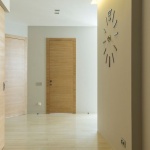
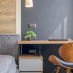
Color can transform a house into a home—evoking mood, shaping space, and tying your style together. Still, picking more than one wall color can feel daunting. How do you achieve a polished, connected look without playing it too safe? In this deep-dive guide, you’ll learn how to combine wall colors effectively with repeatable frameworks, lighting-savvy tactics, and ready-to-use palettes. Whether you’re planning a single room or orchestrating a whole-home flow, these pro strategies will help you select, test, and pair hues with confidence.
What Is Wall Color Harmony—and Why It Matters
Color harmony is the balance that makes a palette feel intentional rather than accidental. Harmonious wall colors create visual rhythm, guiding the eye while keeping rooms calm and coherent. Without harmony, a space can feel scattered or flat. With it, your rooms feel welcoming, styled, and uniquely you—no interior design degree required.
The Science and Psychology Behind Great Palettes
Color Wheel Essentials: Hue, Value, Saturation
Start with the color wheel. It maps primary, secondary, and tertiary hues and shows how colors relate. Three core attributes shape your result:
- Hue: The color family (blue, green, red, etc.).
- Value: Lightness or darkness; lighter values expand, darker values ground.
- Saturation: Intensity; lower saturation feels sophisticated, higher reads energetic or playful.
Balancing these attributes prevents visual noise. For example, pair a mid-value, moderately saturated main color with a lighter, softer partner to avoid a loud clash.
Temperature and Undertones
Every paint has an undertone—a subtle bias that emerges alongside the dominant hue. Grays can skew green or purple; whites can lean warm (creamy) or cool (icy). To maintain harmony:
- Group undertones: Warm undertones with warm, cool with cool, unless you intentionally want temperature contrast.
- Cross-check with swatches: Place candidates against true white to reveal hidden undertones.
- Mind material neighbors: Check undertones against floors, tiles, counters, and big furnishings.
Contrast vs. Cohesion
Harmony isn’t sameness; it’s a poised mix of cohesion and contrast. Use contrast to highlight architecture or create focal points, and cohesion to carry your style through rooms. Consider the contrast triad:
- Hue contrast: Opposite sides of the wheel (e.g., blue vs. orange).
- Value contrast: Light vs. dark of the same or related hues.
- Saturation contrast: Muted partner with a punchy accent.
Pick one type of contrast to star, and let the others play supporting roles. Too much contrast across all three can feel chaotic.
Lighting, Surfaces, and Finish: The Hidden Variables
Natural Light by Orientation
- North-facing: Cooler, consistent light; colors read grayer. Warm up with creamy whites, warm neutrals, or muted earths.
- South-facing: Abundant warm light; most colors thrive. Temper overly bright hues with dustier, desaturated choices.
- East-facing: Warm morning, cool afternoon; favor hues that look good in both (greens, soft blues, warm grays).
- West-facing: Cool mornings, fiery sunsets; watch reds/oranges—they can flare up at dusk.
Artificial Lighting Types
- Warm LEDs (2700–3000K): Enhance warm tones; can dull crisp blues.
- Neutral LEDs (3500–4000K): Balanced; ideal for truer color reads.
- Cool LEDs (5000K+): Make whites icy; can flatten warmer beiges.
Match bulb temperature to your palette goals. Use consistent color temperature in open-plan areas to protect flow.
Finish, Texture, and LRV
Sheen and texture alter perception. Matte hides flaws and looks sophisticated; eggshell adds subtle sheen; satin/semigloss pops trim and resists moisture; gloss is bold and reflective.
Check a color’s LRV (Light Reflectance Value). High LRV colors bounce more light and feel airy; low LRV shades absorb light and feel intimate. Balance LRVs between adjacent rooms to control rhythm and avoid unintentional gloom or glare.
Palette Planning Frameworks that Never Fail
The 60-30-10 Rule (and Smart Variations)
A time-tested composition guide: 60% dominant color (often the main wall color), 30% secondary color, 10% accent. For calmer spaces, try 70-20-10 or 75-20-5. This ratio system tames multi-color palettes and helps you see how much of each hue to deploy.
Classic Color Schemes
- Monochromatic: One hue, varied by value/saturation (e.g., pale sage, mid sage, deep olive). Quiet elegance.
- Analogous: Neighbors on the wheel (blue–blue green–green). Natural, serene flow.
- Complementary: Opposites (blue–orange). Dynamic; best with one muted, one lively.
- Split-Complementary: Main hue plus the two adjacent to its opposite (blue with yellow-orange and red-orange). Energetic yet less risky.
- Triadic: Three evenly spaced hues (e.g., teal, marigold, mulberry). Balanced vitality; mute two and let one shine.
- Tetradic (Double Complement): Two complementary pairs. Advanced; keep saturation controlled and assign clear roles.
- Neutrals with an Accent: Versatile for rentals and resales. Layer texture for depth.
How to Combine Wall Colors Effectively: A Step-by-Step Method
1) Audit the Room and Adjacent Spaces
- Fixed finishes: Floors, tile, countertops, large rugs, major furniture—your non-negotiables.
- Light map: Orientation, window size, shadows, lamp placement.
- Style direction: Scandi calm, modern farmhouse warmth, mid-century color pops, Japandi minimalism, or boho layering.
2) Set the Mood and Function
Decide how you want to feel: restful, focused, cozy, social, energized. Color psychology matters:
- Blues/greens soothe and support focus.
- Earth tones ground and comfort.
- Warm reds/oranges energize and stimulate conversation.
- Neutrals provide flexibility for art and textiles.
3) Choose an Anchor Color and Undertone Family
Pick your dominant wall color first and commit to its undertone family. If your anchor is a warm gray with green undertones, keep neighbors in that warm-green orbit, or plan your contrasts deliberately (e.g., a muted terra-cotta accent).
4) Build the Supporting Cast
- Secondary color for adjacent room or feature wall—usually lower saturation or lighter/darker value of the anchor hue.
- Accent color for small walls, niches, wainscoting, or built-ins.
- Trim/ceiling in a harmonizing white or soft color. Keep trim consistent across connected spaces to preserve flow.
5) Map the Flow
Sketch a plan view of your home and assign colors to each space. Mark sightlines—what rooms you see at once. Avoid placing two bold statements across the same view unless they belong to a deliberate high-contrast concept.
6) Test Like a Pro
- Order large swatches or paint letter-size boards with two coats.
- Move them around throughout the day to check color shifts under different light.
- Compare options side-by-side to expose undertones and LRV differences.
- Live with samples for 48–72 hours before committing.
7) Lock in Sheens and Details
- Walls: matte or eggshell for most rooms; satin for baths/kitchens.
- Trim/doors: semi-gloss for crisp architectural pop.
- Ceiling: flat to conceal imperfections; consider color for height play.
Follow these steps and you’ll instinctively know how to combine wall colors effectively in any space, from compact apartments to open-plan homes.
Transitions and Flow in Open-Plan vs. Traditional Layouts
Open-Plan Spaces
- Keep trim, doors, and ceilings consistent to unify zones.
- Shift value, not hue: use the same color two values lighter/darker to zone dining vs. living without jarring breaks.
- Accent with restraint: one bold wall or built-in per sightline is enough.
Traditional Rooms with Doorways
- Leverage thresholds: door trims act like picture frames; you can switch colors more decisively.
- Echo undertones: new room, new hue, same undertone family for continuity.
- Hallways: choose a friendly neutral that negotiates between bolder rooms.
Room-by-Room Strategies
Living Room
As the social hub, the living room sets your palette’s tone. Pair a calm dominant with an accent on built-ins or a fireplace breast. Try a neutral palette in warm gray-beige with an inky blue media wall for depth, tying leather or natural wood into the mix.
Kitchen and Dining
Kitchens carry strong finish cues (tile, counters). Sample wall colors against backsplash and cabinet undertones. In open plans, relate dining walls to living walls via a value shift. For example, soft sage in the kitchen and lighter sage in the dining area, with shared white trim, reads cohesive.
Bedroom
Prioritize rest. Monochromatic schemes excel here. Consider a desaturated blue-green on the headboard wall and a lighter cousin on the remaining walls. Keep trim warm white for a cocooned feel.
Bathroom
Watch reflections and sheen. If tile is cool white with gray veining, lean into cool undertones: misty blue-gray or pale greige. Small powder rooms can carry dramatic color—deep teal or charcoal—balanced by crisp white ceilings and trim.
Nursery/Kids Room
Opt for mid-value colors (not too light, not too saturated), which are stimulating but not overwhelming. Use an accent wall to organize play zones and pick up colors from textiles that can shift as kids grow.
Home Office
Greens and blues aid focus; muddy earth tones can reduce glare on screens. Consider two-tone walls with a deeper color below a chair rail for gravitas, or paint a niche behind shelving for subtle emphasis.
Entry, Hallways, and Stairs
These are transition engines. Choose a versatile neutral that links rooms. If stairs are visible from multiple zones, paint the stair wall in your anchor or hallway neutral to knit the story together.
Practical Palette Recipes (Copy, Paste, and Customize)
Use these as starting points. Adjust saturation and value for your light conditions.
1) Calm Coastal Minimal
- Main walls: Soft gray-green (e.g., HEX #C9D6CF)
- Secondary: Whisper white with warm undertone (HEX #F6F2EA)
- Accent: Dusty navy (HEX #2F4A60)
- Trim/Ceiling: Clean white (HEX #FFFFFF) in semi-gloss for trim, flat for ceiling
- Notes: Perfect for north-facing rooms needing a gentle lift.
2) Warm Modern Farmhouse
- Main walls: Creamy greige (HEX #E9E2D6)
- Secondary: Mushroom taupe (HEX #B8A89A)
- Accent: Charcoal bronze (HEX #3E3A36)
- Trim: Soft white (HEX #F4F1EB)
- Notes: Works with oak floors and black metal accents.
3) Moody Dramatic Lounge
- Main walls: Deep blue-green (HEX #1F3A3D)
- Secondary: Smoky teal (HEX #335C5B)
- Accent: Burnt brass mustard (HEX #C49A3A)
- Trim/Ceiling: Off-black (HEX #1A1A1A) for trim, warm ivory ceiling (HEX #F5EFE6)
- Notes: Best in south-facing rooms; adds enveloping luxury.
4) Japandi Quiet Neutrals
- Main walls: Putty beige (HEX #D9D2C5)
- Secondary: Clay gray (HEX #C4B8A9)
- Accent: Inky brown-black (HEX #2B2421)
- Trim: Warm white (HEX #F3EFE8)
- Notes: Layer texture—linen, oak, limewash—to prevent flatness.
5) Mid-Century Fresh
- Main walls: Sage gray (HEX #A9B5A7)
- Secondary: Pale apricot (HEX #F7D2B9)
- Accent: Retro teal (HEX #2A7F78)
- Trim: Crisp white (HEX #FAFAFA)
- Notes: Pairs with walnut woods and brass.
6) Boho Color Play
- Main walls: Dusty rose (HEX #D9A5A5)
- Secondary: Sage mist (HEX #C7D1C3)
- Accent: Terracotta (HEX #C46A3C)
- Trim: Cream (HEX #F1E9DB)
- Notes: Balance pattern-heavy textiles with softer wall values.
7) Small-Space Bright and Airy
- Main walls: High-LRV warm white (HEX #F7F4EE)
- Secondary: Feather gray (HEX #E3E1DB)
- Accent: Muted eucalyptus (HEX #8FA79C)
- Trim/Ceiling: Same high-LRV white for lift
- Notes: Keep contrast low; rely on texture for interest.
8) Rental-Friendly Neutral with Punch
- Main walls: Neutral greige (HEX #DAD4CA)
- Secondary: Soft stone (HEX #CFC8BD)
- Accent: Art-led accent wall color from a favorite print (e.g., dusty indigo HEX #506A85)
- Trim: Landlord white (often standard) or warm white peel-and-stick
- Notes: Use removable panels for accent moments.
Handling Tricky Elements with Ease
Fixed Finishes Drive the Bus
Never pick wall colors in a vacuum. Granite with gold veining will reject cool blue-grays. Terracotta tile loves warm, sandy neutrals. Bring paint swatches to your finishes and look for shared undertones.
Wood Tones and Metals
- Honey or red oak: Warm neutrals, greens, and muted blues temper orange undertones.
- Walnut: Plays well with creams, olives, and inky blues.
- Metals: Brass warms palettes; chrome favors cool sophistication; black metal adds crisp contrast.
Patterned Wallpaper and Murals
Pull paint colors from the least obvious hue in the pattern for depth, not the loudest one. Repeat that pulled hue in accessories to stitch the room together.
Working with Existing Furniture
Pick a palette color already present in your largest items (sofa, rug). If the sofa is a cool charcoal, echo it with a lighter cool gray on walls, then add a complementary accent (muted rust) on a single wall or built-in for vibrancy.
Common Mistakes—and How to Avoid Them
- Skipping large samples: Tiny chips lie; boards tell the truth.
- Mixing undertones randomly: Establish a family and stick to it unless you’re intentionally contrasting.
- Overusing bold accents: One star per sightline; let the rest support.
- Ignoring LRV: Dark colors in dim rooms can feel oppressive.
- Inconsistent trim color: Disrupts flow in open concepts.
- Forgetting sheen strategy: The wrong sheen highlights wall flaws or kills depth.
Tools, Samples, and a Pro-Grade Workflow
Digital Helpers
- Color wheel apps and websites (Adobe Color, Coolors): Build schemes quickly.
- AR paint visualizers: Preview walls in your own rooms.
- LRV databases: Compare reflectance to manage brightness.
- Note-taking: Track bulbs used and times of day when you evaluated samples.
Sampling Like a Designer
- Board method: Paint foam boards; move them room to room.
- Edge to edge: Paint to the edge so your eye doesn’t read white borders as part of the sample.
- Label meticulously: Color name, brand, LRV, undertone notes, bulb type.
- Photograph: Morning, noon, evening to study shifts.
Timeline Checklist
- Week 1: Audit, mood board, anchor color selection.
- Week 2: Order samples, test under real lighting.
- Week 3: Finalize sheens and trim plan; buy paint and supplies.
- Week 4: Prep, prime if needed, paint in logical order: ceilings → walls → trim → doors.
Advanced Tips for Confident Color Mixing
- Control saturation: If you love color but fear chaos, keep two hues muted and let one accent shine.
- Use near-whites smartly: A soft white with the right undertone can be your secret secondary color.
- Paint the fifth wall: A colored ceiling (two values lighter than your walls) can add sophistication without clutter.
- Architectural emphasis: Wainscoting, picture rails, or paneling in a second color introduces depth while remaining orderly.
- Zone with value: Open plans benefit from changing value, not hue, between zones to keep unity.
Frequently Asked Questions
How many wall colors can I use in a small home?
Two to three wall colors plus a consistent trim color is a safe sweet spot. Add variety with textiles, art, and wood/metal finishes rather than more wall hues.
Should trim match the ceiling?
Often yes—it amplifies unity. If your ceiling height is modest, a matching trim and ceiling in a warm white can visually raise the space.
Can I combine warm and cool colors?
Absolutely. Make one temperature dominant and use the other as an accent. For example, cool blue walls with a warm camel accent create pleasing tension.
What’s the safest way to do an accent wall?
Choose the wall with a natural focal point (e.g., fireplace or headboard), and shift value or saturation within the same hue family before jumping across the wheel.
How do I protect flow in an open-plan?
Keep trim and ceiling colors continuous, and either use the same wall color throughout or shift one or two values between zones. Limit bold accents to a single focal wall per continuous sightline.
Case Studies: From Overwhelmed to Orchestrated
Case 1: The Clashing Condo
Problem: A cool gray living room met a warm beige hallway and a bright teal kitchen—each chosen in isolation. The result felt disjointed.
Fix: Identified a common green undertone in the floors; switched the hallway to a soft greige with green undertone, toned the kitchen teal down to muted eucalyptus, and deepened the living room gray. Kept trim a unified warm white. Flow restored with minimal repainting.
Case 2: The Dim Den
Problem: North-facing den looked cold in pale blue.
Fix: Chose a warm clay-gray with higher LRV to reflect limited light, added a deeper accent on built-ins, and upgraded bulbs to 3000–3500K. Space turned cozy, not cave-like.
Case 3: The Open-Plan Puzzle
Problem: Kitchen, dining, and living visually bled together with a single white; no character.
Fix: Kept trim/ceiling consistent. Used a mid-value greige in living, a lighter value in dining, and a slightly greener cousin in kitchen to pick up the backsplash. Added one charcoal accent on the media wall. Now zoned yet cohesive.
A Repeatable Recipe for Success
- Gather constraints: finishes, light, style.
- Pick an anchor: commit to its undertone.
- Design a scheme: monochromatic, analogous, complementary, etc.
- Apply 60-30-10: assign roles and proportions.
- Test big: boards in varying light; log notes.
- Finalize sheens: walls vs. trim vs. ceiling.
- Execute cleanly: paint order, crisp taping, consistent bulbs.
Conclusion: Confident Color Mixing Is a System, Not a Gamble
Great palettes don’t happen by luck. They come from clear goals, knowledge of undertones and lighting, and a simple framework that balances cohesion with contrast. With the methods above, you now know how to combine wall colors effectively: choose an anchor, build a supporting cast, test thoroughly, and manage sheen, LRV, and transitions. When in doubt, reduce saturation, keep trim consistent, and let one accent lead. The result? Rooms that feel calm, connected, and completely intentional—no guesswork required.
Quick Reference: Do/Don’t Checklist
- Do align undertones across rooms.
- Do vary value for zoning in open plans.
- Do test colors at multiple times of day.
- Do use the 60-30-10 rule to control proportion.
- Don’t commit without large samples.
- Don’t overuse high saturation across many walls.
- Don’t change trim color randomly between connected rooms.
Ready to start? Pick one room, define your anchor color and undertone, and test two supporting options. Within a weekend, you’ll turn uncertainty into a refined, cohesive palette that flows with confidence from wall to wall.